Issue
There are many answers on StackOverflow that explain how to draw a border around a widget. However, I am looking for something like TextFormField.
The normal DropdownButton has an underline attribute only but I am looking for something like the following design:
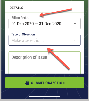
As you can see here, the dropdown list has a border and a title.
I can remove the underline attribute from the DropdownButton widget but is there any custom widget that I can use in order to wrap the DropdownButton?
Solution
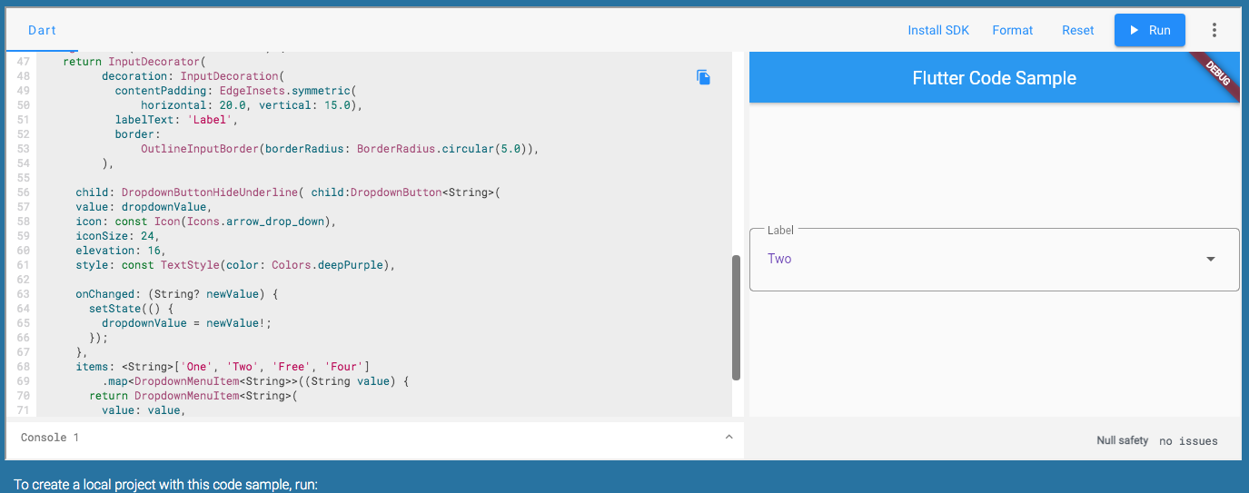
You can replicate this with PopupMenuButton or Wrap it under InputDecorator then hide underline with DropdownButtonHideUnderline
/// Flutter code sample for DropdownButton
// This sample shows a `DropdownButton` with a large arrow icon,
// purple text style, and bold purple underline, whose value is one of "One",
// "Two", "Free", or "Four".
//
// 
import 'package:flutter/material.dart';
void main() => runApp(const MyApp());
/// This is the main application widget.
class MyApp extends StatelessWidget {
const MyApp({Key? key}) : super(key: key);
static const String _title = 'Flutter Code Sample';
@override
Widget build(BuildContext context) {
return MaterialApp(
title: _title,
home: Scaffold(
appBar: AppBar(title: const Text(_title)),
body: const Center(
child: MyStatefulWidget(),
),
),
);
}
}
/// This is the stateful widget that the main application instantiates.
class MyStatefulWidget extends StatefulWidget {
const MyStatefulWidget({Key? key}) : super(key: key);
@override
_MyStatefulWidgetState createState() => _MyStatefulWidgetState();
}
/// This is the private State class that goes with MyStatefulWidget.
class _MyStatefulWidgetState extends State<MyStatefulWidget> {
String dropdownValue = 'One';
@override
Widget build(BuildContext context) {
return InputDecorator(
decoration: InputDecoration(
contentPadding: EdgeInsets.symmetric(
horizontal: 20.0, vertical: 15.0),
labelText: 'Label',
border:
OutlineInputBorder(borderRadius: BorderRadius.circular(5.0)),
),
child: DropdownButtonHideUnderline( child:DropdownButton<String>(
value: dropdownValue,
icon: const Icon(Icons.arrow_drop_down),
iconSize: 24,
elevation: 16,
style: const TextStyle(color: Colors.deepPurple),
onChanged: (String? newValue) {
setState(() {
dropdownValue = newValue!;
});
},
items: <String>['One', 'Two', 'Free', 'Four']
.map<DropdownMenuItem<String>>((String value) {
return DropdownMenuItem<String>(
value: value,
child: Text(value),
);
}).toList(),
), ),
);
}
}
Answered By – flakerimi
Answer Checked By – Gilberto Lyons (FlutterFixes Admin)