Issue
I want to achieve the following animation in Flutter. I’ve created the containers with GestureDetector for that but don’t know how to achieve the animation.
Steps will be like:
- Click any of the item
- The item will displaced
- Corresponding page will be opened
- On coming back to previous page, the item will remained displaced until another item is clicked. Clicking on same item won’t perform anything.
Currently, if any item is clicked, it’s landed to new page without animation
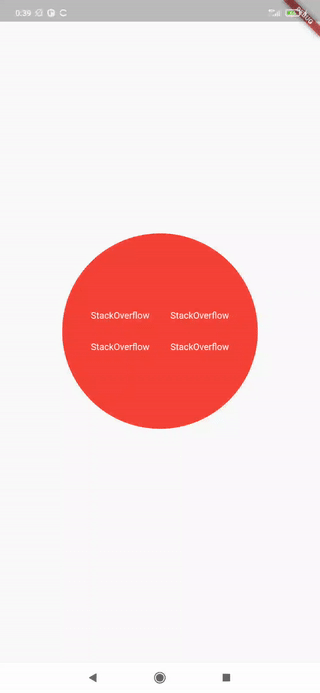
Following is the code I’m using right now. I need the exact output like the attached gif.
GIF: See in Google Drive (Please open in new tab, otherwise this page will be navigated)
Code:
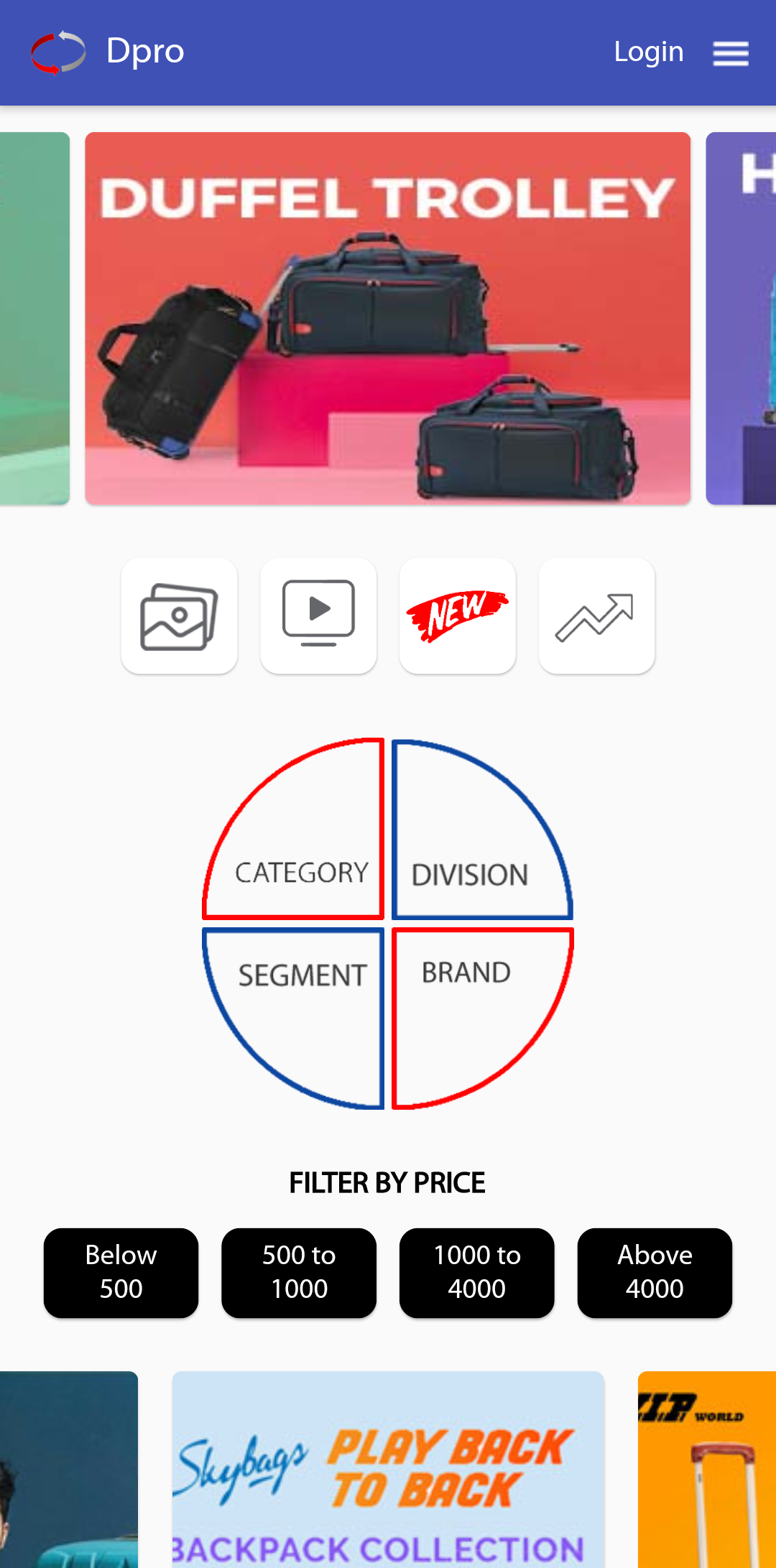
double width = MediaQuery.of(context).size.width;
Container(
       height: width * 0.6,
       width: width * 0.6,
       alignment: Alignment.center,
       child: Row(
             children: [
                    Column(
                       children: [
                            GestureDetector(
                                 onTap: () {
                                      Methods.navigationToDetailsPage(context, 'Category');
                                 },
                                 child: Container(
                                      height: width * 0.6 * 0.5,
                                      width: width * 0.6 * 0.5,
                                      alignment: Alignment.center,
                                      padding: EdgeInsets.fromLTRB(width * 0.06, width * 0.06, 2, 2),
                                      child: Image.asset(
                                            'assets/images/category.png',
                                      ),
                                  ),
                            ),
                            GestureDetector(
                                  onTap: () {
                                     Methods.navigationToDetailsPage(context, 'Segment');
                                  },
                                  child: Container(
                                      height: width * 0.6 * 0.5,
                                      width: width * 0.6 * 0.5,
                                      alignment: Alignment.center,
                                      padding: EdgeInsets.fromLTRB(width * 0.06, 2, 2, width * 0.06),
                                      child: Image.asset(
                                        'assets/images/segment.png',
                                      ),
                                  ),
                              ),
                       ],
                    ),
                    Column(
                        children: [
                            GestureDetector(
                                  onTap: () {
                                      Methods.navigationToDetailsPage(context, 'Division');
                                  },
                                  child: Container(
                                       height: width * 0.6 * 0.5,
                                       width: width * 0.6 * 0.5,
                                       alignment: Alignment.center,
                                       padding: EdgeInsets.fromLTRB(2, width * 0.06, width * 0.06, 2),
                                       child: Image.asset(
                                          'assets/images/division.png',
                                       ),
                                   ),
                            ),
                            GestureDetector(
                                   onTap: () {
                                       Methods.navigationToDetailsPage(context, 'Brand');
                                   },
                                   child: Container(
                                       height: width * 0.6 * 0.5,
                                       width: width * 0.6 * 0.5,
                                       alignment: Alignment.center,
                                       padding: EdgeInsets.fromLTRB(2, 2, width * 0.06, width * 0.06),
                                       child: Image.asset(
                                         'assets/images/brand.png',
                                       ),
                                    ),
                             ),
                        ],
                    ),
             ],
       ),
)
Solution
The code example at the bottom covers:
- How to setup an
AnimationController, see theAnimatedSectorButtonwidget created. - Usage of a
Tweenanimation usingCurvesto smooth the animation flow, see theSectorTilewidget created. - How to create a widget similar in shape to the images you used, this was done with
ClipPathand aCustomClipper.
Note:
Generally using images with text for layout should be avoided, given they are less customizable, and they make it far harder to f.ex. translate an app given per asset you would need an image per language. Better to potentially import a font and create a nice widget yourself.
Illustration of what the code does:
Code example
import 'package:flutter/material.dart';
import 'package:flutter/animation.dart';
import 'package:flutter/rendering.dart';

main() {
  runApp(StackOverflowExampleApp());
}

class StackOverflowExampleApp extends StatelessWidget {
  @override
  Widget build(BuildContext context) {
    return MaterialApp(
      home: Scaffold(
        body: Center(
          child: Column(mainAxisAlignment: MainAxisAlignment.center, children: [
            Row(
              mainAxisAlignment: MainAxisAlignment.center,
              children: [
                AnimatedSectorButton(radius: 150, sectorQuadrant: SectorQuadrant.TopLeft),
                AnimatedSectorButton(radius: 150, sectorQuadrant: SectorQuadrant.TopRight),
              ],
            ),
            Row(
              mainAxisAlignment: MainAxisAlignment.center,
              children: [
                AnimatedSectorButton(radius: 150, sectorQuadrant: SectorQuadrant.BottomLeft),
                AnimatedSectorButton(radius: 150, sectorQuadrant: SectorQuadrant.BottomRight),
              ],
            )
          ]),
        ),
      ),
    );
  }
}

class AnimatedSectorButton extends StatefulWidget {
  final double radius;
  final SectorQuadrant sectorQuadrant;

  const AnimatedSectorButton({required this.radius, required this.sectorQuadrant});

  _AnimatedSectorButtonState createState() => _AnimatedSectorButtonState();
}

class _AnimatedSectorButtonState extends State<AnimatedSectorButton> with TickerProviderStateMixin {
  late AnimationController _controller;

  @override
  void initState() {
    super.initState();
    _controller = AnimationController(duration: const Duration(milliseconds: 1000), vsync: this)
      ..addStatusListener((status) {
        if (status == AnimationStatus.completed) {
          Future.delayed(Duration(milliseconds: 1500)).then((value) async {
            _controller.reverse();
          });
        }
      });
  }

  @override
  void dispose() {
    _controller.dispose();
    super.dispose();
  }

  Widget build(BuildContext context) {
    return SectorTile(
      radius: widget.radius,
      quadrant: widget.sectorQuadrant,
      controller: _controller.view,
      onTap: () {
        _controller.forward();
      },
    );
  }
}

enum SectorQuadrant {
  TopRight,
  TopLeft,
  BottomLeft,
  BottomRight
}

class SectorTile extends StatelessWidget {
  final double radius;
  final SectorQuadrant quadrant;
  final Animation<double> controller;
  final Function() onTap;
  late final Animation<double> offsetValue;
  late final double xSign;
  late final double ySign;

  SectorTile({
    Key? key,
    required this.radius,
    required this.quadrant,
    required this.controller,
    required this.onTap,
  }) : super(key: key) {
    // Here we define the specific of the animation.
    offsetValue = Tween(begin: 0.0, end: 1.0)
        .chain(CurveTween(curve: Curves.fastOutSlowIn))
        .animate(controller);

    // Primarily used for the direction of the animation
    xSign = quadrant == SectorQuadrant.TopLeft || quadrant == SectorQuadrant.BottomLeft ? -1 : 1;
    ySign = quadrant == SectorQuadrant.TopLeft || quadrant == SectorQuadrant.TopRight ? -1 : 1;
  }

  Widget _buildAnimation(BuildContext context, Widget? widget) {
    double value = offsetValue.value * (radius / 3);

    return Transform.translate(
      offset: Offset(value * xSign, value * ySign),
      child: ClipPath(
        clipper: SectorClipper(quadrant),
        child: Material(
          color: Colors.red,
          child: InkWell(
            splashColor: Colors.black87,
            onTap: onTap,
            child: Container(
              width: radius,
              height: radius,
              child: Padding(
                padding: const EdgeInsets.all(16.0),
                child: Align(
                  alignment: Alignment(-xSign, -ySign),
                  child: Text(
                    "StackOverflow",
                    style: TextStyle(color: Colors.white),
                  ),
                ),
              ),
            ),
          ),
        ),
      ),
    );
  }

  @override
  Widget build(BuildContext context) {
    return AnimatedBuilder(animation: controller, builder: _buildAnimation);
  }
}

// Needed for constraining the material splash effect.
class SectorClipper extends CustomClipper<Path> {
  final SectorQuadrant sectorQuadrant;

  SectorClipper(this.sectorQuadrant);

  @override
  Path getClip(Size size) {
    switch (sectorQuadrant) {
      case SectorQuadrant.TopRight:
        return Path()..addOval(Rect.fromCircle(center: Offset(0, size.height), radius: size.height));
      case SectorQuadrant.TopLeft:
        return Path()..addOval(Rect.fromCircle(center: Offset(size.width, size.height), radius: size.height));
      case SectorQuadrant.BottomLeft:
        return Path()..addOval(Rect.fromCircle(center: Offset(size.width, 0), radius: size.height));
      case SectorQuadrant.BottomRight:
        return Path()..addOval(Rect.fromCircle(center: Offset(0, 0), radius: size.height));
    }
  }

  @override
  bool shouldReclip(covariant CustomClipper<Path> oldClipper) => true;
}
Answered By – Tor-Martin Holen
Answer Checked By – Timothy Miller (FlutterFixes Admin)