Issue
There are so many properties in the RaisedButton whose equivalent I can’t find yet in the ElevatedButton. So, how can I convert or replicate a RaisedButton (with all the properties) to the new ElevatedButton?
Like:
RaisedButton(
  onPressed: () {},
  color: Colors.indigoAccent,
  disabledColor: Colors.indigo,
  textColor: Colors.white,
  disabledTextColor: Colors.grey,
  hoverColor: Colors.pinkAccent,
  splashColor: Colors.black,
  elevation: 12.0,
  padding: EdgeInsets.all(20),
  shape: StadiumBorder(),
  child: Text('Button'),
)
Solution
You can construct a new class named MyElevatedButton.
class MyElevatedButton extends StatelessWidget {
  final VoidCallback? onPressed;
  final Widget child;
  final Color? color;
  final Color? disabledColor;
  final Color? textColor;
  final Color? disabledTextColor;
  final Color? hoverColor;
  final Color? splashColor;
  final double? elevation;
  final double? disabledElevation;
  final EdgeInsetsGeometry? padding;
  final OutlinedBorder? shape;

  MyElevatedButton({
    Key? key,
    required this.onPressed,
    required this.child,
    this.color,
    this.disabledColor,
    this.textColor,
    this.disabledTextColor,
    this.hoverColor,
    this.splashColor,
    this.elevation,
    this.disabledElevation,
    this.padding,
    this.shape,
  }) : super(key: key);

  bool _isPressed(Set<MaterialState> states) => states.contains(MaterialState.pressed);
  bool _isDisabled(Set<MaterialState> states) => states.contains(MaterialState.disabled);
  bool _isHovered(Set<MaterialState> states) => states.contains(MaterialState.hovered);

  @override
  Widget build(BuildContext context) {
    final style = ButtonStyle(
      backgroundColor: MaterialStateProperty.resolveWith<Color?>((states) {
        if (_isDisabled(states)) {
          return disabledColor;
        } else if (_isHovered(states)) {
          return hoverColor;
        }
        return color;
      }),
      foregroundColor: MaterialStateProperty.resolveWith<Color?>((states) {
        if (_isDisabled(states)) return disabledTextColor;
      }),
      overlayColor: MaterialStateProperty.resolveWith<Color?>((states) {
        if (_isPressed(states)) return splashColor;
      }),
      elevation: MaterialStateProperty.resolveWith<double?>((states) {
        if (_isDisabled(states)) return disabledElevation;
        return elevation;
      }),
      shape: MaterialStateProperty.all<OutlinedBorder?>(shape),
      padding: MaterialStateProperty.all<EdgeInsetsGeometry?>(padding),
    );

    return ElevatedButton(
      onPressed: onPressed,
      style: style,
      child: child,
    );
  }
}
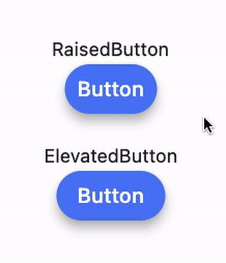
Here’s the example code (one is RaisedButton and the other is ElevatedButton using the same properties)
@override
Widget build(BuildContext context) {
  final onPressed = () {};
  final child = Text('Button');
  final color = Colors.indigoAccent;
  final disabledColor = Colors.indigo;
  final textColor = Colors.white;
  final disabledTextColor = Colors.grey;
  final hoverColor = Colors.pinkAccent;
  final splashColor = Colors.black;
  final elevation = 8.0;
  final disabledElevation = 0.0;
  final shape = StadiumBorder();
  final padding = EdgeInsets.all(12);

  return Scaffold(
    body: Center(
      child: Column(
        mainAxisAlignment: MainAxisAlignment.center,
        children: [
          Text('RaisedButton'),
          SizedBox(height: 4),
          RaisedButton(
            onPressed: onPressed,
            color: color,
            disabledColor: disabledColor,
            textColor: textColor,
            disabledTextColor: disabledTextColor,
            hoverColor: hoverColor,
            splashColor: splashColor,
            elevation: elevation,
            padding: padding,
            shape: shape,
            child: child,
          ),
          SizedBox(height: 30),
          Text('ElevatedButton'),
          SizedBox(height: 4),
          MyElevatedButton(
            onPressed: onPressed,
            color: color,
            disabledColor: disabledColor,
            textColor: textColor,
            disabledTextColor: disabledTextColor,
            hoverColor: hoverColor,
            splashColor: splashColor,
            elevation: elevation,
            disabledElevation: disabledElevation,
            padding: padding,
            shape: shape,
            child: child,
          ),
        ],
      ),
    ),
  );
}
I covered most of the common properties but not all, feel free to add your own because all properties work the similar way. The only thing which was not replicable was the highlightColor of the RaisedButton because the overlayColor‘s set only reflects one property at a time and has precedence over the backgroundColor.
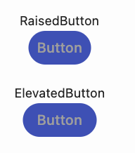
Disabled state:
Answered By – iDecode
Answer Checked By – Senaida (FlutterFixes Volunteer)